All notable changes to this project will be documented in this file. See standard-version for commit guidelines.
-
New
loadingcomponent.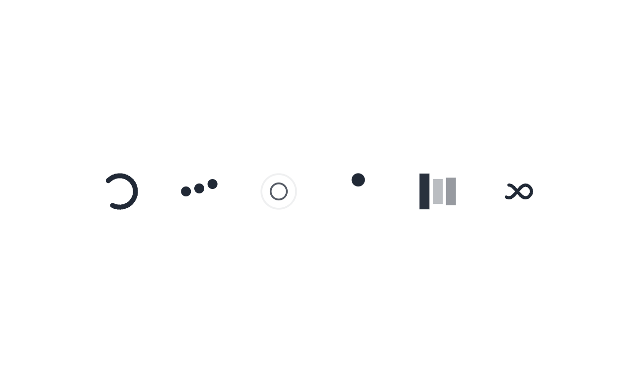
Shows a loading spinner and can be used inside any element.
You can choose different spinners:
loading-spinner,loading-dots,loading-ring,loading-ball,loading-bars,loading-infinityYou can change the color using
text-*utility class. -
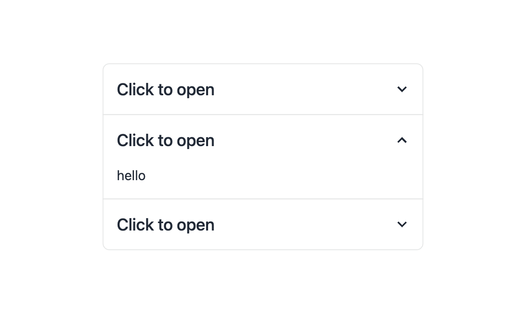
New accordion.
It's
collapsebut now we can use it with radio buttons which allows us to make a JS-free and accessible accordion. -
New
joinclass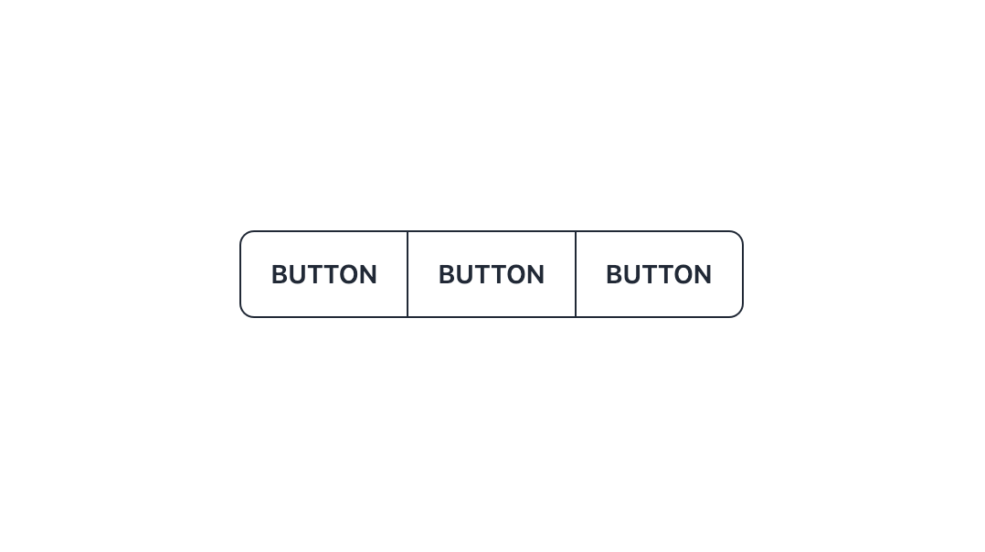
It's a replacement for
button-groupandinput-group(with a more generic name) and it groups items together vertically or horizontally. It also gives border radius to the first and last item (based on responsive direction) and also if your item have a border, it overlaps the border between items so it looks good automatically.joinalso can apply style to the indirect children. It's useful when you want ot have a wrapper around your button (fordropdown,tooltip, etc.) and you just want to apply style to the actual button, not the wrapper.
-
Now only
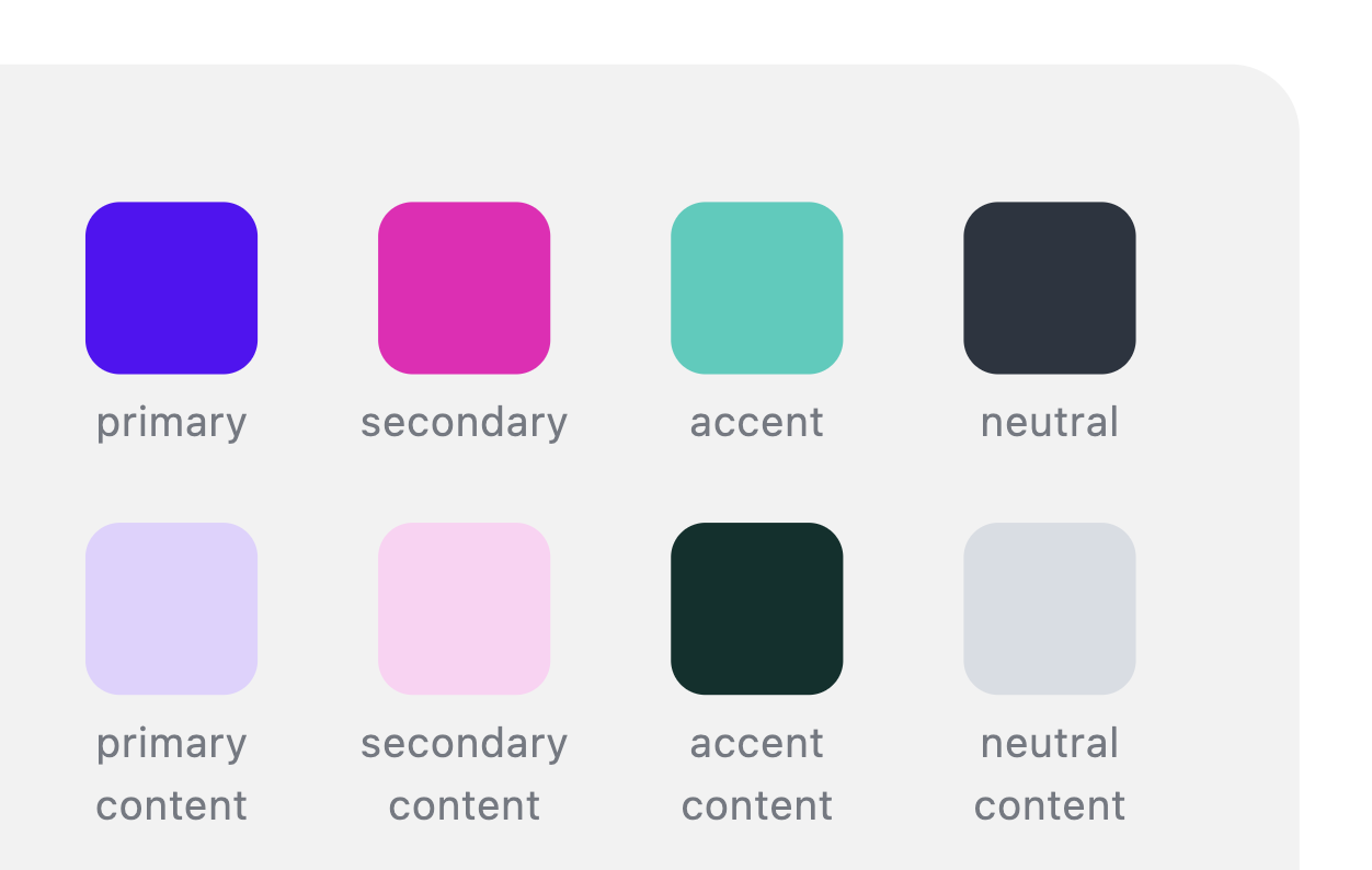
lightanddarkthemes are active by default.You can enable all themes by adding
themes: trueto daisyUI config or you can list the names of the themes you want.https://daisyui.com/docs/config/
This is a decent improvement for CSS size on majority of websites because most developers use only 2 or 3 themes but all themes being active by default, was increasing the CSS size unnecessarily.
-
The default
darktheme is now darker and it looks more comfortable when using a website at night. -
Following themes had improvements in colors and are now more accessible when combining different elements together:
light,dark,bumblebee,forest,garden,halloween,luxury,retro,synthwaveOf course you can still customize the colors as you wish or even add your own themes.
-
drawerno longer disables the root element scroll. Now it naturally let's the root element scroll.Even with providing a responsive and collapsible sidebar, it no longer has daisyUI 2.x limitations like losing the scroll position when the page is changes or disabling the scroll on the root element.
-
Now
draweris hidden by default.Instead of using uncustomizable
drawer-mobile, we can use a responsive class likelg:drawer-opento show drawer on specific screen sizes.Previously it wasn't customizable and
drawer-mobilewas only showing the drawer onlg:screen size.Update your drawer class:
- <div class="drawer drawer-mobile">
+ <div class="drawer lg:drawer-open">
-
modalnow supports the new native HTML element<dialog>as well.<dialog>provides accessibility features without needing JS:- Locks the focus inside the modal
- Closes the modal when you press the escape key
- Can be closed when you click outside the modal
- Prevents z-index issues
- Accessible for screen readers
-
Add new
modal-backdropclass. The backdrop that covers the back of modal so we can close the modal by clicking outside. -
Add new
modal-topmodifier if you want to align themodalto the top of the screen (modal-middleandmodal-bottomare also available)<button class="btn" onclick="my_modal.showModal()"> open modal </button> <dialog id="my_modal" class="modal"> <form method="dialog" class="modal-box"> <p>Content</p> <button class="btn">Close</button> </form> </dialog>
-
tooltipnow gets visible with keyboard navigation as well. -
tooltipclass is now responsive.You can use responsive prefixes like
sm:,md:etc to showtooltiponly on specific screen sizes. -
All
tooltipposition modifiers (tooltip-top,tooltip-bottom,tooltip-left,tooltip-right) are now responsive as well. So you can move the tooltip to different directions using responsive prefixes. This is useful when your tooltip is on the edge of screen on some screen sizes.
-
New
btn-neutralmodifier class for button.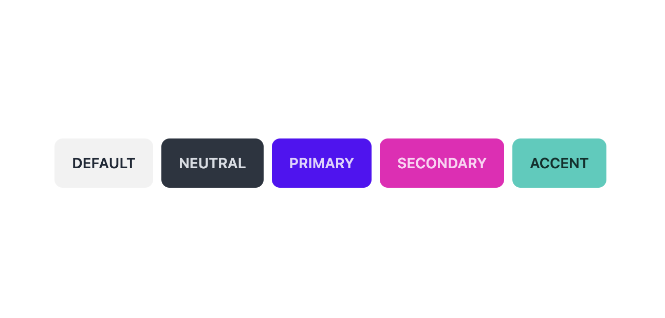
-
The default
btnis now usingbg-base-200background color instead ofneutral(a high contrast dark color) color.Previously the default button was using a high contrast color and we didn't have any options to make a subtle button to look as consistent as other solid colors (
primary,secondary, etc.) With this color as a default, we can have consistent set of solid buttons without relying on variants likebtn-ghostorbtn-outlinewhich are not always the best option.Now when we need a dark button we can use
btn-neutralmodifier class. -
btnclick animation now has slightly less bounce effect. -
The default
btnfocus ring color is nowneutralinstead ofneutral-focus -
btnnow has agap-2by default. Useful for having text and icons inside a button, next to each other. -
New
badge-neutralmodifier class for badge.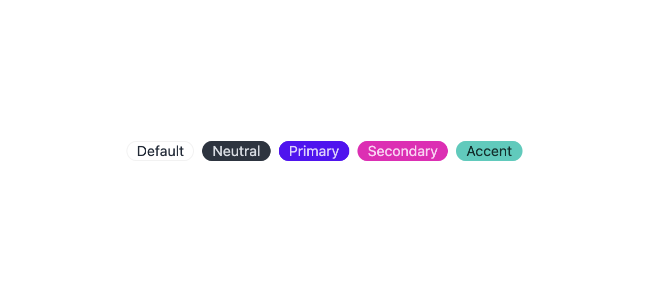
-
The default
badgeis now usingbg-base-200background color instead ofneutral(same as the default button) -
badge inside the menu now justifies to the end by default.
This is useful when you use a badge inside a menu item because it aligns to the end of the menu item automatically.
You can use
justify-self-*to override this behavior. -
All new style for
menu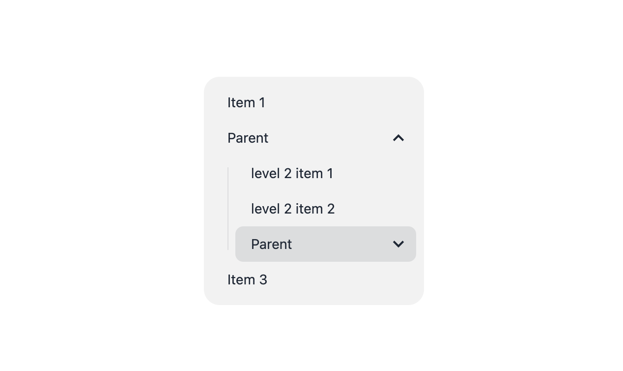
-
All menu levels (
ul > li > ul > ...) now have a consistent style. Showing a visually recognizable hierarchy (instead of opening a floating menu for the 2nd level by default and putting the rest of the levels inside the menu).This is good news for people who need multiple levels of submenu (either vertical or horizontal)
<ul class="menu">
  <li><a>Item 1</a></li>
  <li>
    <a>Parent</a>
    <ul>
      <li><a>Submenu 1</a></li>
      <li><a>Submenu 2</a></li>
    <li>
    <a>Item 3</a>
  </li>
</ul>
-
Using the standard
<details>element now you can have collapsible submenu without any extra class name ortabindex, without relying ondropdown.<!-- Easy collapsible submenu --> <ul class="menu"> <li><a>Item 1</a></li> <li> <details> <summary>Parent</summary> <ul> <li><a>Submenu 1</a></li> <li><a>Submenu 2</a></li> <li> </details> <a>Item 3</a> </li> </ul>
This allows us to easily create a multi-level 👏 collapsible 👏 accessible 👏 JS-free 👏 responsive 👏 and still customizable 👏 menu just by using a class name
https://daisyui.com/components/menu/#collapsible-submenu
Also, you can now create responsive "mega menus" using daisyUI.
See all examples: https://daisyui.com/components/menu/
-
Menu items are slightly smaller now. This makes more consistency with other components.
-
Now menu has padding by default. No need for
p-*class -
Menu items have border radius by default (you can change it using
rounded-*utility classes)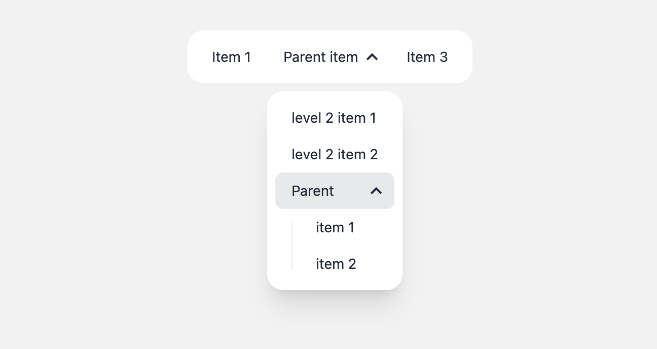
-
instead of
menu-compactclass now we have the standard sizing utilities like other elements:menu-xsmenu-smmenu-mdmenu-lg
-
<li>withactiveclass now has aneutralbackground color instead ofprimary. This creates a better design hierarchy and moves the focus to the more important elements like "call to action" buttons. -
new class name
menu-dropdown-togglefor the parent item if you want to control it using JS -
new class name
menu-dropdownfor the collapsed submenu if you want to control it using JS -
new modifier class name
menu-dropdown-showfor to reveal the collapsed submenu if you want to control it using JShttps://daisyui.com/components/menu/#collapsible-submenu-that-works-with-class-names
-
badgeinside the menu item now justifies to the end by default. -
New
.focusclass for menu items applies the same style when you focus the menu item using a mouse. This class name is useful if you want to apply styles for keyboard navigation as well.
-
-
dropdownnow supports<details>tag as well.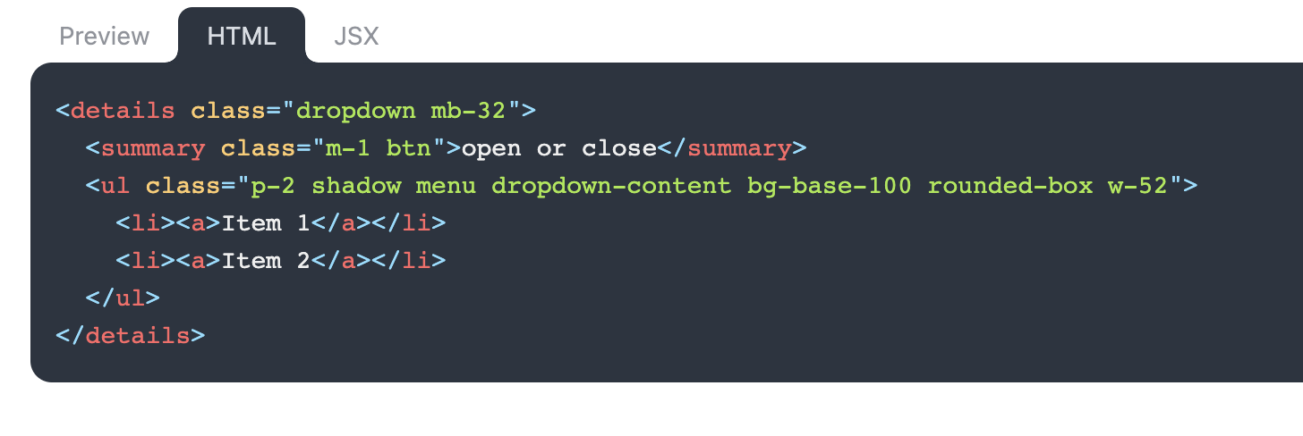
This allows us to close the dropdown on second click or control the dropdown using JavaScript.
Class names are the same as before, but the HTML structure is simpler.
<details class="dropdown">
  <summary class="btn">open or close</summary>
  <div class="dropdown-content">Content</div>
</details>
The former HTML structure of
dropdown(using CSS focus) is still supported and you can use whichever you prefer. -
carouselis nowinline-flexby default (instead offlex)This makes it easier to use carousel aside other elements.
-
btnclass can now be used on<input type=radio>and<input type=checkbox>as well.This is really usefull when you want to make a group of buttons visually those buttons are just changing a value. It's also better for accessibility because it's a native HTML element, it supports keyboard navigation and you won't need to deal with JavaScript or hidden inputs and labels.
<input type="radio" aria-label="Option 1" class="btn" />
<input type="radio" aria-label="Option 2" class="btn" />
The
aria-labelvalue will be shown inside the button by default and it's also accessible for screen readers. When radio input is checked, it gets the primary color (but you can customize it of course)Same thing for checkbox:
<input type="checkbox" aria-label="Check me!" class="btn" />
https://daisyui.com/components/button/#buttons-with-different-html-tags
-
New style for
.table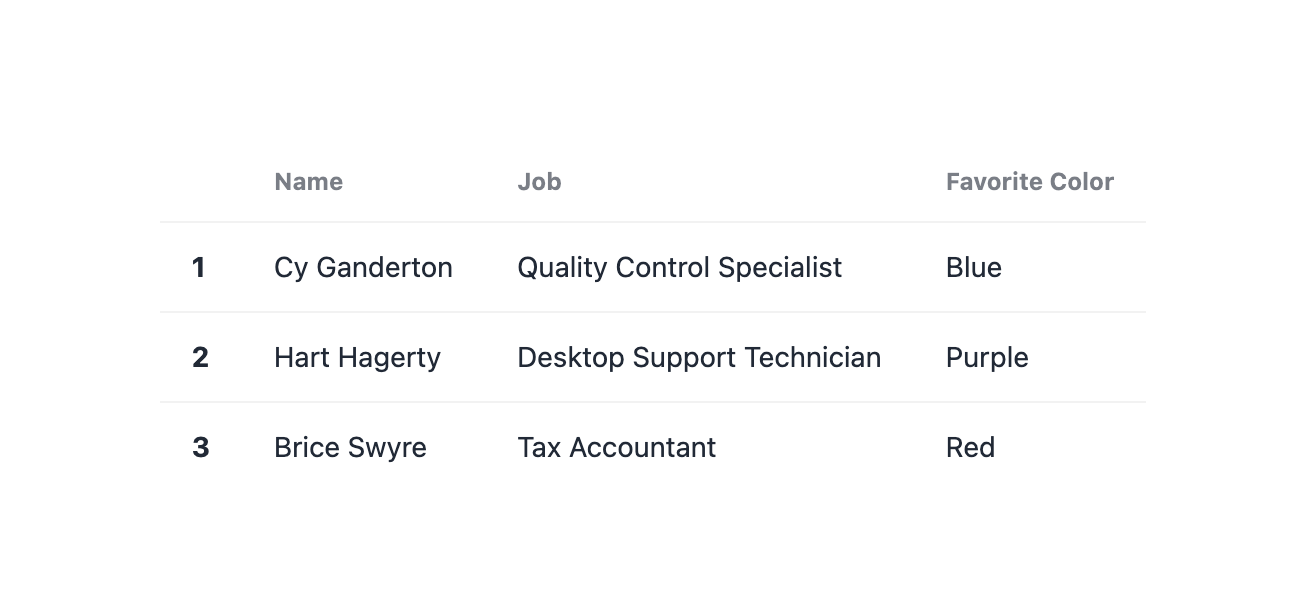
Starting with daisyUI 3.0,
.tablehas a less opinionated style. It allows us to use tables on every surface colors and apply our own background color if needed.Previously every table cell had background color and the whole table had a very opinionated border radius, header color, etc. This was not very flexible and it was hard to customize. But now you can use utility classes to customize the table as you wish.
-
tablenow has 4 sizes:table-xs,table-sm,table-md,table-lgwhich provides different font sizes and paddings to fit well on different screen sizes. -
New modifier class names
table-pin-rowsandtable-pin-colsfortableThese classes are useful when you want to pin the heading row or heading column of a table. It's useful for tables with a lot of columns or rows.
Previously table's first header was pinned by default and this was limiting the use cases. Now you can use these classes only if you want the header to be pinned.
table-pin-rowsmakes the row inside<thead>sticky to top and the row inside<tfoot>sticky to bottom.table-pin-colsmakes the<th>columns sticky to left and right automatically. -
Improve
collapsetransition. No more jumps. -
collapsenow works with<details>tag as well.This allows us to create a collapsible content without any extra class name or
tabindex, without relying on CSS:focus.<details class="collapse"> <summary class="collapse-title">Click to open/close</summary> <div class="collapse-content">content</div> </details>
This is useful when you want to create a collapsible content that is accessible and works without JavaScript.
-
collapsenow works with radio inputs as well. This allows you to create an accordion JS-free where opening 1 item closes the other items.<div class="collapse"> <input type="radio" name="my-accordion-1" checked="checked" /> <div class="collapse-title">Click to open this and close others</div> <div class="collapse-content">Content</div> </div> <div class="collapse"> <input type="radio" name="my-accordion-1" /> <div class="collapse-title">Click to open this and close others</div> <div class="collapse-content">Content</div> </div> <div class="collapse"> <input type="radio" name="my-accordion-1" /> <div class="collapse-title">Click to open this and close others</div> <div class="collapse-content">Content</div> </div>
-
:hoverstyles are now only available on devices that actually support hover.On devices without hover, It's always annoying to work with elements that have hover styles because with the first tap, the hover style is applied and it won't go away until you tap somewhere else. This is confusing and annoying for a lot of people and it's not a good user experience.
Starting with daisyUI 3.0, hover styles are disabled on devices that don't support hover.
-
Now
:disabledbuttons and form elements have a disabled style as well. Previously the style was only applied to the elements withdisabledattribute or*-disabledclass name.This is useful when you want to disable the whole form using a fieldset.
-
Removed
drawer-mobileclass. If you want to have a fixed drawer on desktop but you want to hide it on mobile uselg:drawer-openinstead (or any other responsive prefix)Update your HTML:
- <div class="drawer drawer-mobile">
+ <div class="drawer lg:drawer-open">
-
Removed extra wrapper
<div>fromalert.
The previous HTML structure was not very efficient and it was causing many confusions because that extra div was necessary for the style to work properly.Update your
alertstructure and remove that extra div inside<div class="alert">:<div class="alert"> - <div> <span>12 unread messages. Tap to see.</span> - </div> </div>
-
tablenow has awidth: 100%by default.This may not be a breaking change for most people. Most developers already want the table to fill the width and they use it with
w-fullclass or the data itself is long enough to cover the width. But if you have a small table, placed next to other elements, you should now addw-autoor another width class to the table to make it smaller. -
tabledoesn't have aactivemodifier class anymoreWith the new style you can use utility classes to apply background color for a row. Previously it wasn't possible because each cell had a background color and we had to rely on a new modifier class like
active. Now you can usebg-base-200or any other color.- <tr class="active"> + <tr class="bg-base-200">
-
tabledoesn't have ahovermodifier class anymoreNow you can use
hover:bg-base-200or any other color instead. It's more flexible and you don't have to style each table cell separately.- <tr class="hover"> + <tr class="hover:bg-base-200">
-
tabledoesn't have atable-compactmodifier class anymore.Use one of these new size modifiers instead:
table-xs,table-sm,table-md,table-lg- <table class="table table-compact"> + <table class="table table-sm">
-
btndefault color isbase-200now.This creates consistency for all our solid button variants while providing access to the whole color palette.
You can use the new modifier
btn-neutralif you prefer to keep the former color (neutral) for your button:- <button class="btn">Button</button> + <button class="btn btn-neutral">Button</button>
-
dropdowndoesn't have az-indexby default now.Using z-index for
dropdownas a default style was a mistake because sometimes we need elements on top of th dropdown and sometimes we want the dropdown to be on top of other elements. Now you can usez-[1]or any other z-index class to control it as you want. -
badgeinsidebtnnow doesn't inherit thebtncolor automatically anymore. This was a bad design decision and it was limiting us to customizebadgecolors when it's inside abtn
- Fix
stepconnectors not being visible on RTL mode. - Fix
radioanimation on Safari. - Fix
dropdown-hovernot working when focused using keyboard. - Fix
tooltiparrow using pixel formats and causing inaccurate positioning with different browser zoom levels. - Fix
toastwhitespace issue
- In the package, directory
/src/colorsis renamed to/src/themingbecause it's doing more than colors and the previous name was confusing. - Remove extra dev dependencies.
- Console log is now more informative. It warns you about possible config issues and how to fix them.
- daisyUI repo itself is now smaller in size and it takes less disk space. Also the new document website is running on the latest version of SvelteKit and Vite.
2.51.5 (2023-03-21)
2.51.4 (2023-03-15)
2.51.3 (2023-03-01)
2.51.2 (2023-02-27)
2.51.1 (2023-02-25)
2.51.0 (2023-02-22)
- Add type definitions for the package
- Add new
tab-disabledclass name for visually disabling a tab item - Add border radius to all tabs in
tabs-boxed(not just the active tab)
- #1366 add type for daisyui plugin (#1469) (1b39afb)
- #1613 (24393be)
- border-radius in now applied to all tabs (tabs-boxed) (#1626) (0c648f2)
2.50.2 (2023-02-20)
2.50.1 (2023-02-14)
2.50.0 (2023-02-01)
- #1560
menu-titleopacity and color inheritance (bec2094) - #1562 (469cb2c)
- #1564 collapse arrow in RTL mode (c8c7353)
- #1567 remove
ratingborder radius on mobile (df41fbc) - indicator white space (7df6173)
2.49.0 (2023-01-25)
2.48.0 (2023-01-25)
textareanow hasxs,sm,mdandlgsizes: #1462
-
A
tooltipwithout adata-tipattribute will not show an empty tooltip anymore #1501 -
Fix bordered menu entry on sub menus #1536
2.47.1 (2023-01-25)
2.47.0 (2023-01-16)
- More precise Hex to HSL conversion .Now HSL values round to 5 decimal places instead of 0 (36d27f0)
- docs: Bordered menu item preview has incorrect class (#1505) (e2857f7)
- docs: typos in the Portuguese translation (#1482) (763726c)
- docs: update and improve japanese translation (#1510) (4fbba93)
2.46.1 (2023-01-02)
2.46.0 (2022-12-20)
2.45.0 (2022-12-15)
2.44.0 (2022-12-15)
2.43.2 (2022-12-12)
2.43.1 (2022-12-12)
2.43.0 (2022-12-09)
2.42.1 (2022-11-24)
- RTL style for
chat(3887c6e)
2.42.0 (2022-11-23)
- Add new component
chat(522bc5e)
2.41.0 (2022-11-16)
- Disabled
togglenow looks different from unchecked toggle
2.40.1 (2022-11-14)
- border radius of file input on Safari (f938fe3)
2.40.0 (2022-11-14)
- #1350 File Input Button for Safari (#1351) (c623168)
- remove collapse-content cutoff (#1352) (cbeaa60)
- Bottom navigation now respects the iOS safe-area
2.39.1 (2022-11-11)
2.39.0 (2022-11-09)
- #1308 (af8e43c)
- #436, add smooth closing animation (d5a795a)
- docs: missing periods + minor changes (#1328) (ab1ec52)
2.38.1 (2022-11-05)
2.38.0 (2022-11-01)
- Card no longer has
overflow: hidden. Instead, the figure will adapt the card border radius, fix: #1175 (10786e6)
- #1050 (0626701)
- #1245 (34782ce)
- #1267 (89434c2)
- #1302 (f343ed4)
- #698, feat: Now dark themes have
color-schemefor scrollbar etc. (40bab42)
2.37.0 (2022-10-31)
- #1069 (781a805)
- #1148 (be35220)
- #1230 (f8a5df4)
- #1266 (fe0d201)
- #762, feat:
darkThemeconfig now can befalseto disableprefers-color-scheme: dark(d7688cc) - #875 (ae61625)
2.36.1 (2022-10-29)
2.36.0 (2022-10-29)
2.35.0 (2022-10-29)
Add the following color variants
- success
- warning
- info
- error
for the following components:
- range
- toggle
- radio
- checkbox
2.34.1 (2022-10-29)
2.34.0 (2022-10-29)
- #1186 (938d047)
- #1265 (f25bf92)
- #1275 (6bba2de)
- #834 (aa6e812)
- Error from comments in modal react examples (#1278) (b96415b)
2.33.0 (2022-10-20)
2.32.0 (2022-10-20)
2.31.0 (2022-09-21)
- menu width (261ced5)
2.30.0 (2022-09-21)
2.29.0 (2022-09-20)
- menu width and menu item shrink issue (f57942e)
2.28.0 (2022-09-16)
2.27.0 (2022-09-10)
btn-group-horizontalandbtn-group-verticalclasses are now responsive (f27340b)
2.26.0 (2022-09-10)
- allow utility classes to change padding and min-height for
collapse(e0fa734)
2.25.0 (2022-09-05)
- 70% smaller size for
maskstyles
