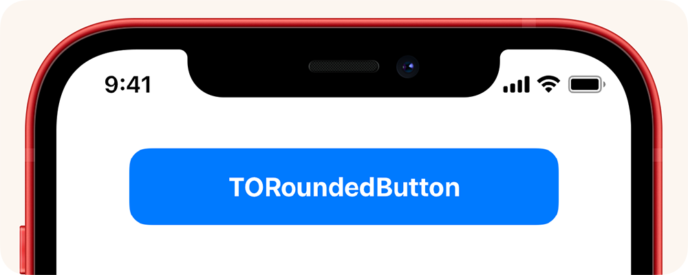
TORoundedButton is an open source UI control of a standard user button. Its design consists of displaying text on top of a solid rectangle with rounded corners. This UI style has started becoming more and more common in iOS 11 and above, and while Apple has an official one they use internally, it is not possible to achieve this effect without heavily customizing UIButton.
TORoundedButton has been crafted to be as graphically performant as possible, based on guidance from Core Animation engineers from Apple at WWDC 2019. It is not simply a subclass of UIButton. Instead, it is a subclass of UIControl with all button graphics and behavior re-engineered from scratch.
In 2021, Apple finally introduced an official way to create rounded UIButton styles with the new UIBackgroundConfiguration API. If your app targets iOS 15 and above, you should consider using the official API instead.
- A completely custom implementation; no
UIButtonhacking. - Implemented with guidance from Core Animation engineers at WWDC 2019.
- Uses the classic Apple 'continuous' curving style on iOS 13 and up.
- Extremely flexible with many options for configuring the look and feel of the button.
- Integrates with Interface Builder for visual configuration.
- Elegantly cancels and resumes animations when the user slides their finger on and off the button.
- Piggy-backs off most standard
UIViewproperties in order to minimize the learning curve. - Includes dynamic color code to generate a 'tapped' shade of the normal color, saving you extra effort.
- Fully compatible with Swift, with the class name
RoundedButton.
TORoundedButton features a complete default configuration useful for most app instances, but can be easily modified beyond that.
// Create a new instance of `RoundedButton`
let button = RoundedButton(text: "Continue")

// The button color itself is controlled via tintColor
button.tintColor = .red

// If desired a brightness offset that will be used to
// dynamically calculate the 'tapped' color from the default one.
button.tappedTintColorBrightnessOffset = -0.15

// A closure is used to detect when tapped
button.tappedHandler = {
    print("Button tapped!")
}
One important thing to remember is that the button color is controlled via tintColor and not backgroundColor.
TORoundedButton will work with iOS 10 and above. While written in Objective-C, it will easily import into Swift.
Copy the contents of the TORoundedButton folder to your app project.
pod 'TORoundedButton'
github "TimOliver/TORoundedButton"
This sort of button style is more or less a bread and butter requirement of a lot of iOS apps. But with even that being the case, it wasn't offered as an official implementation in UIButton until iOS 15.
Because of this, most developers will achieve this look by simply giving a UIButton a solid background, and then using the Core Animation cornerRadius API to round the corners.
This sort of "just-in-time" solution is fine for the vast majority of apps out there that might need one or two rounded buttons. But certainly for apps that would want many of these buttons, and demand all the buttons look and behaviour is consistent, then it's a no-brainer to create a standardised library for this style.
In addition to that, while UIButton is a vary capable API, it is quite limiting. For example, it's not possible to animate the button zooming as it is tapped, or any other custom behaviour.
As such, in order to give this control as much control and flexibility over UIButton, it made sense to simply subclass UIControl to get all of the system interaction features, and then custom tailor the visual look on top of it.
During WWDC, it's usually possible to visit Apple engineers in the labs to get 1-on-1 engineering consultations. In 2019, this library was shown directly to two engineers from the Core Animation team, and they were exceptionally helpful in clearing up some misconceptions this library had assumed.
Some of the tips they mentioned included:
- The original codepath this library used where it generated an opaque background in Core Graphics was basically an anti-pattern. The memory consumption and CPU overhead of creating these bitmaps almost certainly outweighed the performance gains over simply using the
cornerRadiusAPI. - Core Animation is very smart in that if no subview content will be clipped, it uses Metal to draw the
cornerRadiusclipping as a transparent bitmap. Transparent blending is basically free on modern iOS devices, so this is much more preferable to using an opaque bitmap from Core Graphics. - If there is subview content that might be clipped, Core Animation must do an off-screen render pass (This can be tested in the Simulator by checking "Off-screen rendered"). While doing this occasionally is fine, it is still a much heavier graphics operation than regular transparency blending and should always be avoided if it can be helped.
TORoundedButton was created by Tim Oliver as a component of iComics.
iOS device mockup art by Pixeden.
TORoundedButton is available under the MIT license. Please see the LICENSE file for more information.


