https://github.com/hypeitinc/CustomSlider.git
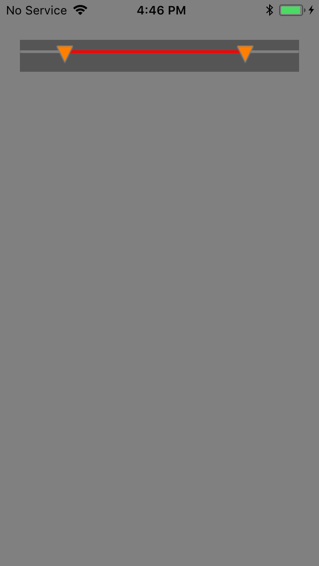
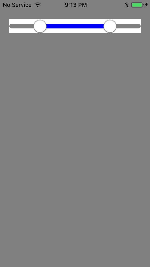
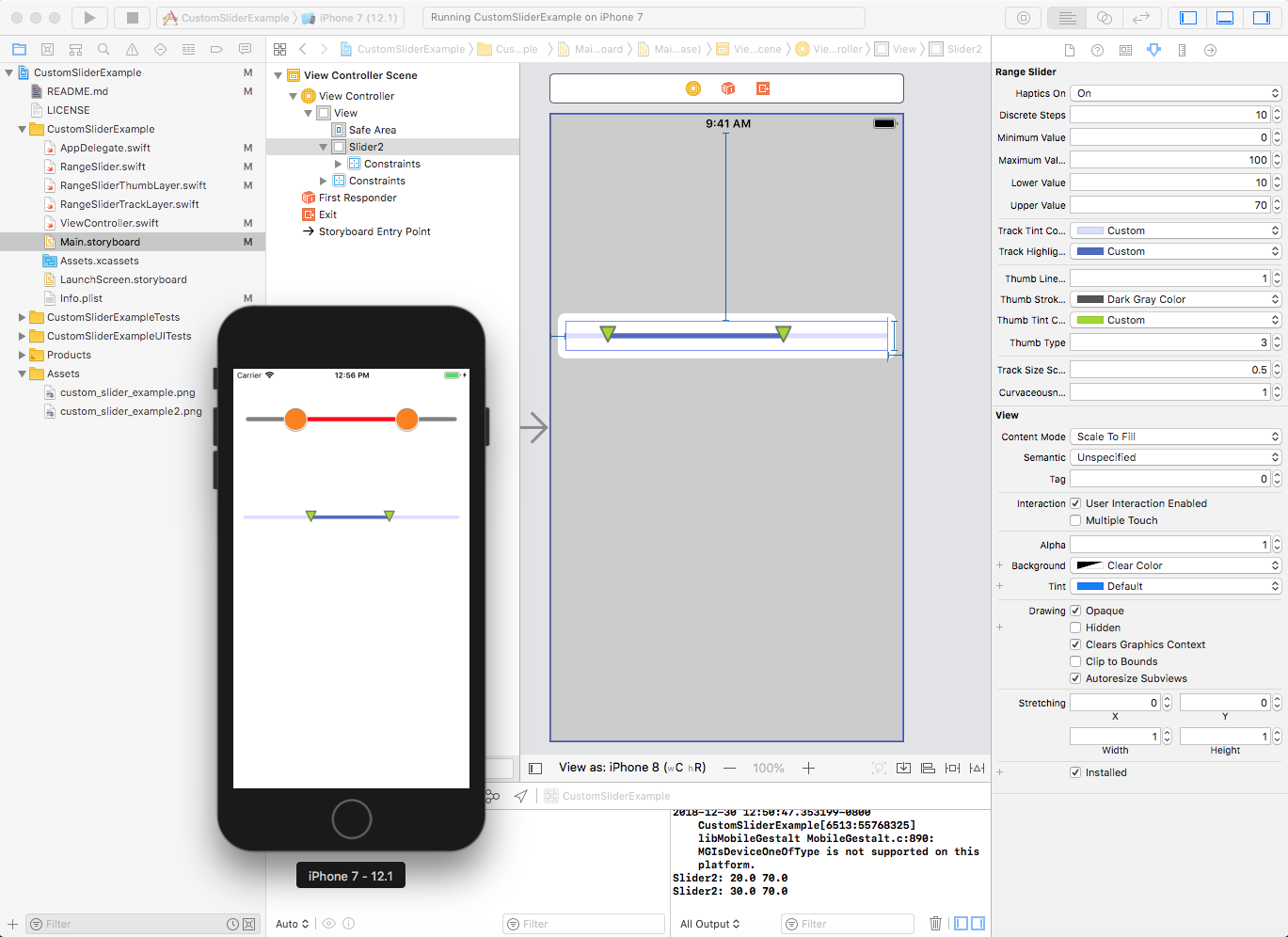
Custom range slider with two thumbs for iOS 12 and Swift 4.2 Added parameter for setting discrete steps and haptic feedback. Fully IBDesignable and IBInspectable. The included example shows both fully programatic setup as well as using the Interface Builder Storyboards. A Swift 4 conversion of the tutorial "How To Make a Custom Control Tutorial: A Reusable Slider" on raywenderlich.com https://www.raywenderlich.com/76433/how-to-make-a-custom-control-swift Take it from here and make it what you want it to be.
- There are a number of public properties you can use to control the appearance of the slider. See ViewController for example. All properties declared in the RangeSlider class.
- The thumbs can be set to circular, rounded or sharp square, or triangle and are built using CoreGraphics and not pictuers.
- The track thickness can be separately set from the view/thumbs height by scaling
- more thumb shapes?
- fix the problem with non-circular thumbs not completely covering the ends of the track.
- there are likely a number of range checks on properties that need to be done in order for the class to be more crash proof.
Just copy the RangeSlider*.swift files into your project. See the ViewController.swift file for an example on how to use. You can also just download and build this project as it is.
var hapticsOn = false // activate haptic feedback for slider movements
var discreteSteps: Int = 0 // Number of discrete steps for the slider over the full range
var minimumValue: Double = 0.0
var maximumValue: Double = 1.0
var lowerValue: Double = 0.2 // current slider value for lower thumb
var upperValue: Double = 0.8 // current slider value for lower thumb
var trackTintColor: UIColor = UIColor(white: 0.9, alpha: 1.0)
var trackHighlightTintColor: UIColor = UIColor(red: 0.0, green: 0.45, blue: 0.94, alpha: 1.0)
var thumbLineWidth: CGFloat = 1.0 // the outline line width for the thumbs
var thumbStrokeColor: UIColor = UIColor.gray // the outline line color for the thumbs
var thumbTintColor: UIColor = UIColor.white
var thumbType = 0 // e.g. number of corners: 0 = circle , 2 = stroke, 3 = triangle, 4 = square
var trackSizeScale: CGFloat = 1.0 // to force track size relative to thumbs
var curvaceousness: CGFloat = 1.0 // controls the radius on circular thums and the track ends. A lower value will give shaper corners so the circle will turn into a rounded square.
Pull requests regarding upcoming features (or bugs) are welcomed. Any suggestion or bug please open up an issue 👍 Not sure how much further I will take this - so feel free to fork and do your own thing.
none
the tutorial "How To Make a Custom Control Tutorial: A Reusable Slider" on raywenderlich.com https://www.raywenderlich.com/76433/how-to-make-a-custom-control-swift
Licensed under MIT License. See LICENSE for details.


