-
Notifications
You must be signed in to change notification settings - Fork 4
Home
imlplots is an R package that provides an interactive Shiny dashboard for three kinds of Interpretable Machine Learning (IML) plots
- Partial Dependence Plots (PDP)
- Individual Conditional Expectation (ICE) plots
- Accumulated Local Effect (ALE) plots
Load the imlplots package.
library(imlplots)To show how you can use the imlplots Shiny app for regression tasks we use fire data, where the burned area of forests due to fires should be analyzed.
print(summarizeColumns(fire)[, -c(5, 6, 7)], digits = 4)## name type na mean min max nlevs
## 1 month factor 0 NA 1.0 184.0 12
## 2 day factor 0 NA 54.0 95.0 7
## 3 FFMC numeric 0 90.64468 18.7 96.2 0
## 4 DMC numeric 0 110.87234 1.1 291.3 0
## 5 DC numeric 0 547.94004 7.9 860.6 0
## 6 ISI numeric 0 9.02166 0.0 56.1 0
## 7 temp numeric 0 18.88917 2.2 33.3 0
## 8 RH integer 0 44.28820 15.0 100.0 0
## 9 wind numeric 0 4.01760 0.4 9.4 0
## 10 rain numeric 0 0.02166 0.0 6.4 0
## 11 area numeric 0 12.84729 0.0 1090.8 0
The target variable is area, which is between 0.00 and 1090.84 ha.
summary(fire$area)## Min. 1st Qu. Median Mean 3rd Qu. Max.
## 0.00 0.00 0.52 12.85 6.57 1090.84
We create a regression task with target variable area.
fire.task = makeRegrTask(data = fire, target = "area")Next we train several mlr models and save them in a list of models. Note: The order in your model list will determine the model order in the Shiny dashboard.
fire.rf = train("regr.randomForest", fire.task)
fire.glm = train("regr.glm", fire.task)
fire.svm = train("regr.svm", fire.task)

mod.list = list(fire.rf, fire.glm, fire.svm)
No we can open the imlplots Shiny app.
imlplots(data = fire, task = fire.task, models = mod.list)The Shiny dashboard contains four tabs
- Data
- Settings
- Plots
- Learner Summary
The Data tab shows your input data. This data is taken to generate IML plots. If you want to check how changes in the data effect your plot, you can simply filter in the Data tab.
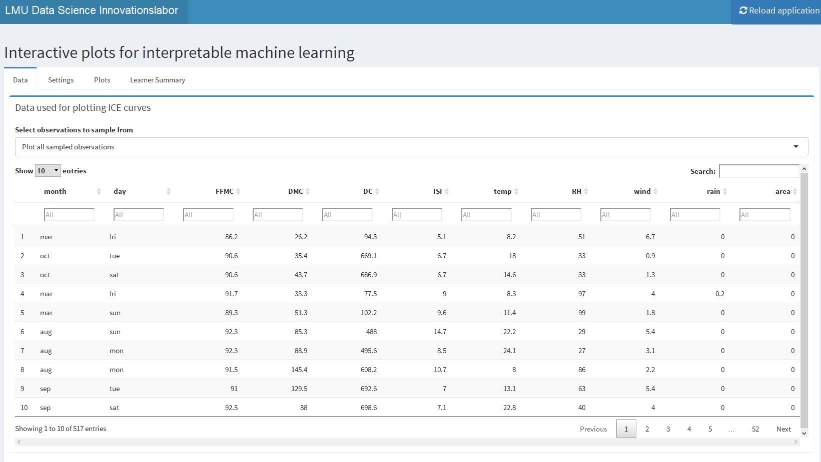
For filtering two options are given
-
Plot all sampled observations: In this setting you can filter via the filters beneath the column titles and all rows will be used for plotting. -
Plot indiviudal observations: In this setting after using the filters, you have to manually select specific rows.
The next tab Settings contains all possible plot settings and the selected IML plot.
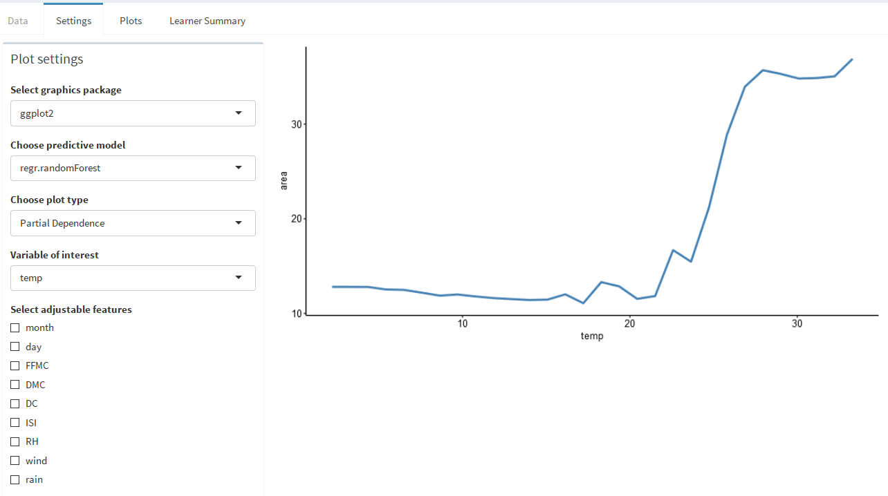
There are various settings
-
Select graphics package: You can select the graphics package - we offerggplot2andplotly. Useggplot2if your computer is not the fastest one. -
Choose predictive model: Choose one of your fitted models. The order in the dropdown is the order of your list. -
Choose plot type: We offer PDP, ICE and ALE plots If you select ICE plot, you will get a new selection field. Possible arecenteredandregularICE plots -
Variable of interest: This dropdown will determine the x-axis of your plot and will determine the effect that is plotted
On the right side of the dashboard page, the selected plot is shown.
To check out effects, you can turn on Select adjustable features. This option allows you to set one of the variables to a specifc value.

It is also possible to change the number of knots and lines (individual observations) with the shown sliders.
The ICE plot contains all sampled, individual observations in blue. The red line is from PDP.

As described above, you can select between Regular and Centered ICE plots.
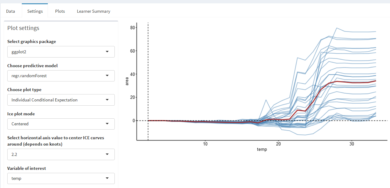
The ALE plot can be selected, too. Please keep in mind, that the ALE plot has a different y-axis than the PDP and ICE plot.
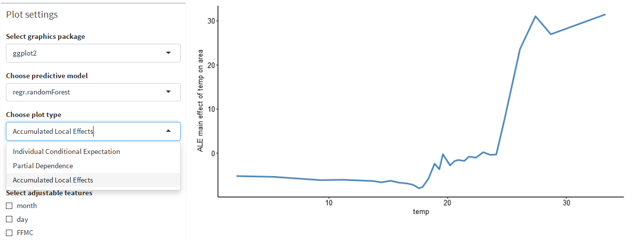
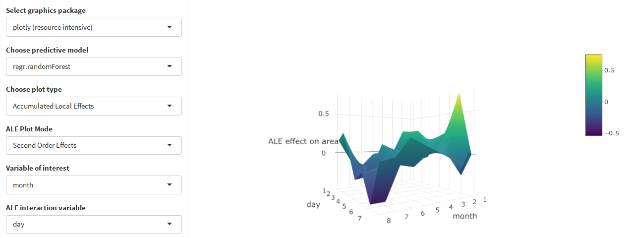
For ALE plots you can swith between two ALE Plot Modes. The Main Effets mode allows you to select one variable of interest and shows its interaction effect. The Second Order Effects setting allows to select another ALE interaction variable and therefore shows the effect for this extra variable too. If you select plotly as graphics package, the second order effects ALE plot will be a 3D plot.
The third tab Plots shows the selected IML plot in full screen via the sub-tab Zoomed plot. The sub-tab Scatterplot shows the filtered and unfiltered scatterplot between the variable of interest and the target variable of the model.
In the Data tab we filtered for a high value of burned area and selected three individual observations.

The filtered data scatterplot shows the selected high area values and also the three individual observations (in red).
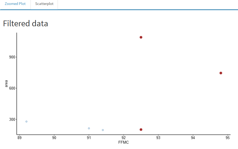
The unfiltered data scatterplot shows all data points and also the three individual observations (in red).
The fourth tab Learner Summary shows the currently selected learner summary. If you want to see another summary, you have to select another model in the Settings tab.

library(imlplots)

fire.task = makeRegrTask(data = fire, target = "area")

fire.rf = train("regr.randomForest", fire.task)
fire.glm = train("regr.glm", fire.task)
fire.svm = train("regr.svm", fire.task)

mod.list = list(fire.rf, fire.glm, fire.svm)

imlplots(data = fire, task = fire.task, models = mod.list)For the classification example only the differences to the regression example will be explained. We use the titanic data set, where the aim is to predict the survival chance.
print(summarizeColumns(titanic)[, -c(5, 6, 7)], digits = 4)## name type na mean min max nlevs
## 1 Pclass factor 0 NA 277.0000 709.0 3
## 2 Survived factor 0 NA 500.0000 809.0 2
## 3 Sex factor 0 NA 466.0000 843.0 2
## 4 Age numeric 0 29.5032 0.1667 80.0 0
## 5 Sibsp integer 0 0.4989 0.0000 8.0 0
## 6 Parch integer 0 0.3850 0.0000 9.0 0
## 7 Fare numeric 0 33.2811 0.0000 512.3 0
## 8 Embarked factor 0 NA 2.0000 914.0 4
## 9 farePp numeric 0 20.5090 0.0000 512.3 0
## 10 deck factor 0 NA 1.0000 1014.0 9
## 11 portside factor 0 NA 110.0000 1059.0 3
Again we create a task and fit a model.
library(imlplots)

titanic.task = makeClassifTask(data = titanic, target = "Survived")
titanic.rf = train("classif.randomForest", titanic.task)
Next we open the Shiny dashboard.
imlplots(data = titanic, task = titanic.task, titanic.rf)This time it is useful to select plotly in the Select graphics package dropdown.
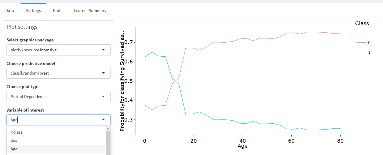
This allows you to deselect single classes to increase the visability of individual lines, which is very useful for ICE plot.
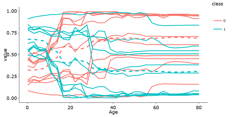
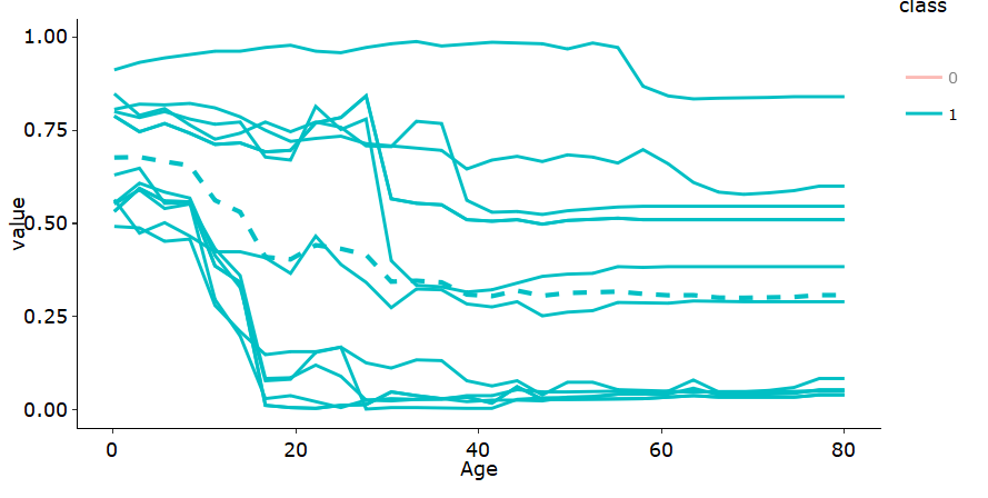
Please note that there is no second-order ALE plot for classification tasks.
library(imlplots)

titanic.task = makeClassifTask(data = titanic, target = "Survived")
titanic.rf = train("classif.randomForest", titanic.task)

imlplots(data = titanic, task = titanic.task, titanic.rf)